[AM-04-067] Gridding, Interpolation, and Contouring
Gridding is the act of taking a field of measurements and discretizing it into a regular tessellation, often either a lattice of squares or hexagons. Gridding can either discretize continuous phenomena or aggregate discrete instances; in either case, gridding serves conceptually to assist analysis, for example in finding local minima or maxima (i.e., "hotspots"). The process of gridding often involves interpolation, which is the rational estimation of unknown data values within the bounds of known values. Contouring refers to the creation of isolines throughout a data surface, often one represented by a grid. This section describes gridding, interpolation, and contouring, highlighting a few example methods by which interpolation is frequently done in the geospatial analysis.
Tags
Introduction
Raposo, P. (2025). Gridding, Interpolation, and Contouring. The Geographic Information Science & Technology Body of Knowledge (2025 Version), John P. Wilson (Ed.). DOI: 10.22224/gistbok/2025.1.18
Explanation
- Gridding
- Interpolation
- Contouring
1. Gridding
Gridding is the process of either discretizing a continuous phenomenon or aggregating discrete instances of a phenomenon into a tessellation. In geographic analysis and modeling, this usually happens in two dimensions on a plane, but three or higher dimensions (e.g., including time as a fourth dimension) are possible as well. Typically the tessellation is regular, with equally sized and shaped cells or pixels. When stored digitally, these grids can be in either raster (e.g., GeoTIFF) or vector (e.g., a hexagonal grid, such as those found in some discrete global grid systems, or DGGS) formats.
1.1 Discretizing Continuous Phenomena
In order to provide a representation of continuous phenomena, data often contain a large series of samples of the phenomenon in question laid throughout the regularly spaced and sized cells of some grid. The most common grid by far is that of regular squares, making up the pixels of a raster model. Depending on the phenomenon represented, the raster might be referred to as a model (e.g., as in topography and digital elevation models, or DEMs), or as an image (e.g., as in an image of infra-red light taken from an aerial sensor). In either case, grids can be multi-band, meaning that the surface may be stored in multiple coincident layers of cells, each representing discretized values of some defined range of a phenomenon (e.g., a multi-spectral image might have a band for each of infrared, red, green, and blue light ranges).
Discretizing is often achieved by taking point samples. If done by a sensor, the value recorded in each pixel (and each band) may be subject to a non-uniform point spread function ( Braat, van Haver, Janssen, & Dirksen, 2008), whose differing levels of sensitivity throughout the area of the pixel mean that the continuous phenomenon is sampled in such a way as to approximate an infinitesimal point. While the raster data resulting from this records a seemingly uniform aereal pixel, the data more truly represents a point on a smooth and differentiable (in the calculus sense) surface.
1.2 Aggregating Discrete Instances
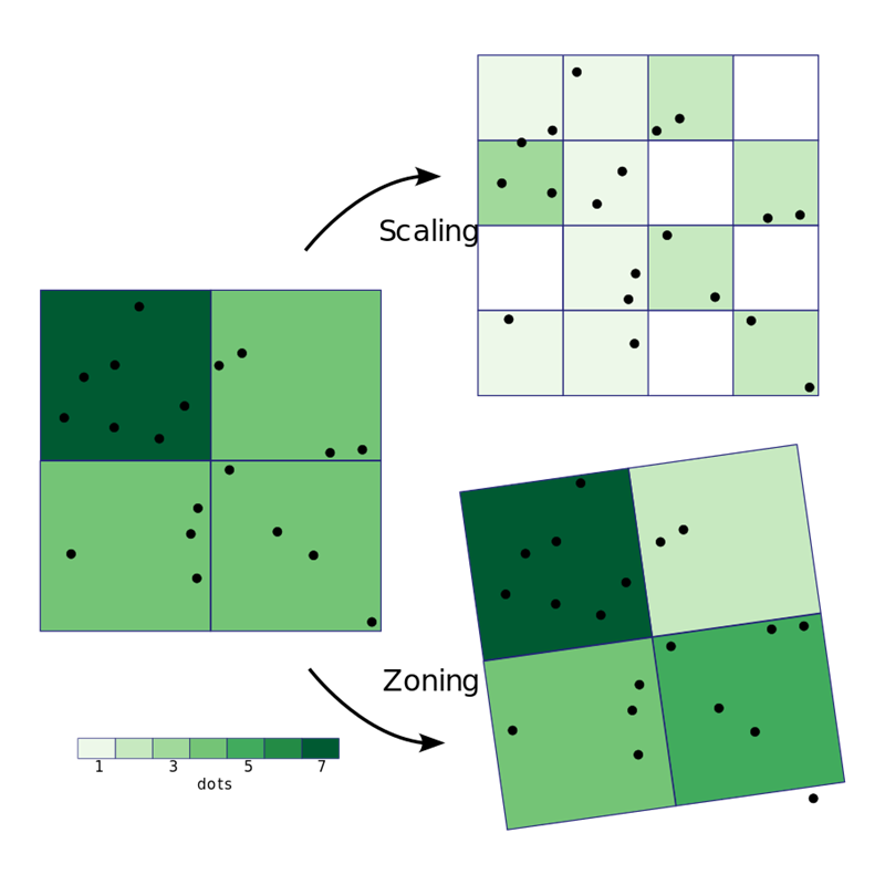
Modeling many instances of some discrete phenomenon (e.g., point locations of photos taken) as a relatively smooth and fluctuating surface is often done by imposing a grid on the area in question, and then tallying, averaging, or otherwise statistically summarizing the instances in each grid cell. This provides a seamless and contiguous representation through space of what is actually a phenomenon constituted by discrete events (see Figure 1). This type of analysis is often employed in social studies in order to examine how events or behaviors fluctuate through an area in quality or quantity (e.g., instances of crimes of various types or severities can be gridded in order to find areas with relatively high or low crime rates). This gridding can create the necessary data to produce heatmaps or hotspot analysis. More commonly than when discretizing continuous phenomena, grids that aggregate discrete instances may be hexagonal, capitalizing on the lower anisotropy of that tessellation (Raposo, 2013).

The resolution (i.e., cell size) of the grid and its placement have decisive effects on summaries recorded in each cell. In the same way how larger bins in histograms tend to result in less pattern revelation, and how smaller bins tend to result in more unhelpful noise, gridding bin size may be set to some hypothetical optimum size given the phenomenon in question and its density, with sizes too small or too large producing less revealing distributions. Similarly, different placements of the grid mean that phenomenon instances fall into or out of cells in differing configurations, leading to different summaries in the cells (see Figure 2). These considerations, respectively the scaling and zoning of area aggregations, form the two major components of the modifiable areal unit problem (MAUP), to which such gridding is subject.
2. Interpolation
Numerous data processing procedures require the determination of values that our input datasets lack. Interpolation is the process by which unknown values that lie surrounded and within the range of existing data points are estimated, based on some set of assumptions about how the phenomenon recorded by the data is expected to distribute itself. Interpolation is one of two processes that attempt to populate regions lacking data points based on some reasoning; extrapolation (not covered in this chapter) is the other, being defined the same as interpolation above, except that it occurs beyond the range of, and not surrounded by existing data points, and is, as a consequence, significantly less data-guided and supported.
There are several methods of interpolation. The various methods make differing assumptions about how the data values representing the interpolated phenomenon distribute themselves in space or time, and they model these distributions at various levels of complexity. Some methods are deterministic, meaning that they find some logical or mathematical formula by which they model the data distribution, and they simply substitute-in independent variables (often the x and y of geographical coordinates) and compute the dependent, interpolated variable from nearby input data values. Others are probabilistic, meaning that they proceed the same way, except first finding a function specifically fit to the input data and characterized by probability bounds (Wasser & Goulden, 2024).
The essential process of interpolation is illustrated in Figure 3 using two example methods. Also illustrated in the figure is a way interpolation can fail by missing noteworthy changes in the phenomenon because it is done over input data at a resolution too coarse to follow the Nyquist-Shannon sampling theorem ( Nyquist, 1928; Shannon, 1948). That theorem explains that reliable sampling of a signal, such that all the fluctuations of that signal can be recorded or recreated, happens when the sampling resolution is half the size of, or finer, than the size of the smallest fluctuations in the signal. In Figure 3, the spike in signal is not captured by the sampling data, nor recreated by interpolation, because the sampling frequency is too large compared to the width of the spike.

2.1 Some Interpolation Techniques
- Nearest Neighbor. Perhaps the simplest method of interpolation, and the most naïve of any patterns in the interpolated phenomenon, is the nearest neighbor method. This approach simply replicates the value of the nearest input point for each interpolated point.
- Voronoi Tessellation. Functionally similar to nearest neighbor interpolation, one can use a Voronoi tessellation (also known as Thiessen or Dirichlet polygons) constructed around known data points. Any interpolated value takes the same value as the point that generated the polygon wherein it sits. A Voronoi tessellation is illustrated in blue in the background of Figure 4.
- Natural Neighbor. This interpolation method makes use of two Voronoi tessellations: one formed around the known input points, and another formed by those points plus one new point for the location being interpolated. The addition of the new point creates one new Voronoi polygon that overlaps its neighbors from the first tessellation. The relative amount of overlap with each neighbor is used to weight that polygon’s generating point’s value in a weighted sum (Sibson, 1981). The process is illustrated by an example in Figure 4. The process is notable for taking no user-chosen parameters, whereas most interpolation methods require the user to tune or select various weights or distances.

- Inverse Distance Weighting (IDW). IDW seeks to directly apply Tobler’s First Law of Geography, which states that the similarity of objects or measures in geographic space decays with distance. This method uses a weighted average of nearby input points, where each input point is weighted inversely to its distance. Distance can weight points linearly, or through an exponential curve, so that decay of influence accelerates more or less quickly with distance. The value of an interpolated point is given by
where
and where z is the value at input point i, w is the weight assigned at point i, d is the distance to the known point i, and p is a user-chosen power determining the function by which weight decays with distance (see Figure 5). When p = 0, that relationship is linear, but typically uses of this interpolation method employ higher p values, such as 2 or 3 (or fractional, non-integer values). It is difficult to determine fitting p values that accurately model the phenomenon being interpolated, even single phenomena can differ (e.g., rough vs. smooth terrain), and this matter is further complicated by issues of resolution. Consequently, trial and error can be used to pick a p value that fits, which can be evaluated using re-survey or ground-truthing. IDW can be further parameterized by limiting the search radius for input known points, or by limiting their count.

- Bilinear Interpolation. This method of interpolation is best-suited to rectilinearly-spaced input data (e.g., raster pixels), as it takes advantage of that structure to proceed. The four closest surrounding points to the point being interpolated are identified. Linear interpolation is applied first in one direction, and then in the orthogonal direction. Equivalent to using linear interpolation is to calculate a sum of the four input points, where each is weighted in proportion to the area of the quadrant rectangle each forms with orthogonal lines passing through the interpolated point (see Figure 6).

- Kriging. Kriging is a sophisticated, probabilistic method of interpolation that seeks to quantify the distance over which spatial autocorrelation is present in the data and then use this distance to inform interpolation. It further seeks to measure error levels, so as to give a measure of confidence on the resultant interpolation. The method is covered in greater detail in this Body of Knowledge entry.
3. Contouring
One way to represent a 3-dimensional surface with 2-dimensional symbols is by contours. These are lines of constant elevation drawn at arbitrary (but usually regular) intervals; their nature is to form concentric loops up or down prominences or depressions, respectively. Contours are a specific form of isoline (i.e., lines of constant value), which are themselves a kind of level set (i.e., the set of all points on a surface at a given elevation).
Gridding operations, such as digital elevation model (DEM) creation, produce quantized (i.e., pixilated or cell-aggregated) surface representations. As grids are typically stored in raster formats, converting these surfaces to isoline collections moves from the pixel model to a vector polyline model.
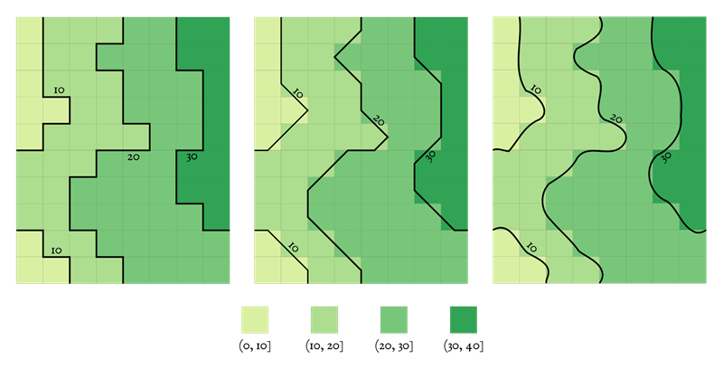
One way to achieve contouring from a gridded raster dataset is to classify all pixels into equal-interval bins representing the desired contour intervals, and then take spatial class pixel borders as linear contours (see Figure 7). The relatively sharp and jagged edges of pixels resulting from this can be replaced by smoother contours, produced with either interpolation along the jagged lines or simplification or smoothing operations.
Contouring, and optionally ramping fill symbols such as color lightness between contour lines, creates a vector map representation of a fluctuating surface. Such a map can be useful in illustrating clustering or hotspots in a dataset in a way comparable to that achievable with gridded datasets.
References
- Braat, J. J. M., van Haver, S., Janssen, A. J. E. M., & Dirksen, P. (2008, January). Chapter 6 Assessment of optical systems by means of point-spread functions. In E. Wolf (Ed.), Progress in Optics (Vol. 51, pp. 349–468). Elsevier.
- Nyquist, H. (1928). Certain topics in telegraph transmission theory. Transactions of the American Institute of Electrical Engineers, 47(2), 617-644
- Raposo, P. (2013). Scale-Specific Automated Line Simplification by Vertex Clustering on a Hexagonal Tessellation. Cartography and Geographic Information Science, 40(5), 427-443.
- Shannon, C. E. (1948). A Mathematical Theory of Communication. The Bell System Technical Journal, 27(3), 379-423.
- Sibson, R. (1981). A Brief Description of Natural Neighbor Interpolation. In: Barnett, V., Ed., Interpreting Multivariate Data, John Wiley & Sons, New York, 21-36.
- Wasser, L., & Goulden, T. (2024, Feb). Going on the grid – an intro to gridding & spatial interpolation. NEON, Battelle.
Learning outcomes
-
1831 - Identify geospatial data that can be usefully gridded for analysis.
Identify geospatial data that can be usefully gridded for analysis.
-
1832 - Describe the relationship between gridding and the modifiable areal unit problem (MAUP).
Describe the relationship between gridding and the modifiable areal unit problem (MAUP).
-
1833 - Explain how interpolation is sensitive to input sample data, such as when data points are missing, or insufficiently dense.
Explain how interpolation is sensitive to input sample data, such as when data points are missing, or insufficiently dense.
-
1834 - Discern between different methods of geospatial interpolation, and select between them with respect to fitness for use in a given setting.
Discern between different methods of geospatial interpolation, and select between them with respect to fitness for use in a given setting.
-
1835 - Describe how contours relate to level sets.
Describe how contours relate to level sets.
-
1836 - Explain how contours can be made from gridded input datasets.
Explain how contours can be made from gridded input datasets.
Additional resources
- Esri. Understanding interpolation analysis. https://pro.arcgis.com/en/pro-app/latest/tool-reference/spatial-analyst/understanding-interpolation-analysis.htm.
- Walczak, S. and Marwaha Kraetzig, N. (2024, Oct). Turning Points into Surfaces: Exploring Interpolation Techniques in GIS. Geo Awesome. https://geoawesome.com/turning-points-into-surfaces-exploring-interpolation-techniques-in-gis/.
- Wasser, L., and Goulden, T. (2024, Feb). Going on the grid – an intro to gridding & spatial interpolation. NEON, Battelle. https://www.neonscience.org/resources/learning-hub/tutorials/spatial-interpolation-basics.