[DA-034] GIS&T and Political Science
Applications of GIS in Political Science encompass analyses and visualizations of populations, states and governments and the interactions between them; and inform decision making in a wide range of venues including policy making, political and electoral behavior and geopolitical interactions broadly. The theoretical antecedents of GIS applications in political science derive from several academic traditions, primarily related to spatial analysis, environmental determinism, and political geography, and are focused on how political and economic factors shape election outcomes. Therefore, the application of GIS in political science is characterized by its emphasis on analyzing and visualizing the spatial dependencies and patterns that underlie political processes. In this way Political Science GIS can be integrated with, expand and inform aspects of other venues of GIS like economics, criminal justice, planning and more.
Tags
Introduction
Fuller, B. (2025). GIS&T and Political Science. The Geographic Information Science & Technology Body of Knowledge (2025 Edition), John P. Wilson (ed). DOI:10.22224/gistbok/2025.1.8.
Explanation
- Introduction to Space and Territory
- The Political Map and the Origins of Political Cartography
- Expanding Bureaucracy and Data Collection
- The Quantitative Revolution and Political GIS
- Applications of GIS in Political Science
1. Introduction to Space and Territory
Political Science is a highly interdisciplinary area of research and activity and encompasses perspectives from philosophy, history, social sciences, psychology, law, economics, geography and international relations. This collaborative approach enables political scientists to utilize diverse theories and methodologies to analyze complex political processes and derive comprehensive understandings of political behavior, institutions, and systems like governance, policy-making, power dynamics, and international relations.
This wide-ranging disciplinary environment provides many opportunities to use tools like Geographic Information Systems (GIS) to facilitate analyses and create cartographic visualizations. GIS enables political scientists to visualize and analyze spatial aspects of political processes like electoral patterns, demographic patterns and changes, and the geographic distribution of economic resources. GIS can be used to visualize how different regions vote and illustrate factors influencing voting behavior like unemployment, education level, income, and other cultural and social characteristics.
Studying demographic changes with GIS enables political scientists to identify patterns and movements within populations, which can influence policy decisions and political strategies. Furthermore, GIS can be used to study the spatial distribution of economic resources and infrastructure, and show areas of inequality and inform more equitable policy development.
Despite the wide range of applications and disciplinary perspectives, the fundamental concept underlying spatial analyses of political science is territory which is a space controlled by a person, organization or government. Territory represents a range of spatial scales in which people live and interact. From personal space which serves a variety of safety and perceptual functions relating to a person’s sense of self (Glassner); and from there to neighborhoods where groups of people who, for example, may be of similar language and culture live in ethnic enclaves; and to larger-scale territories like cities, counties, states and nations where shared group characteristics are increasingly less cohesive and the administrative apparatus of governments tend more to define the space and control the territory (Glassner).
The spatial aspects of political science are more manifest at these larger scales, where group choice and behavior are more consequential. As social complexity increases over time, and governments expand their functions and responsibilities, there is a growing need to organize and manage territories systematically. In the United States, spatial units like census tracts, ZIP codes, school districts and congressional districts were created to facilitate analyses of populations, ensure adequate representation of populations in government and manage distributions of resources at various scales for specific reasons.
Creating spatial units like these require detailed information about what is inside the territory. For example, Zone Improvement Plan (ZIP) codes were developed by the United States Postal Service to optimize mail delivery, and are based on the volume of mail in an area. ZIP codes with high population and a large volume of mail are small in area, while sparsely populated ZIP code areas with lower volumes of mail are often much larger. Similarly, census tracts were developed by the United States Census Bureau to enable better management of population counts and statistical aggregation of the population counts in official reports. Census tracts were first developed in 1910 and are based on estimates of population growth and distribution based on previous census, and are revised from time to time as these estimates change. School districts are another example of defined territories, established to organize and manage public education within specific geographic boundaries, ensuring that educational resources are distributed efficiently and that students attend schools within their designated areas, and so facilitate efficient administration and local governance of educational policies.
2. The Political Map and the Origins of Political Cartography
Representation of territory is one of the most basic and enduring practices in cartography and the political map is a well established category of cartographic representation, and, arguably, has antecedents in antiquity.
In contrast to other types of maps like physical maps which represent characteristics of the Earth’s physical geography, a political map represents territory controlled or administered by a government. Modern maps show clearly drawn borders surrounding countries or sub- national units like provinces or counties. On the other hand where the precise location of a border is unknown or contested, a dashed line may be used to represent competing interests in an area such as in the Kashmir region on the border of India and Pakistan.

However, these precise lines are a modern invention and are the result of advanced surveying techniques and diplomatic interactions. In pre-modern times, the definition of a territory often relied on the features of the natural environment. For example, the first chapter of Julius Caesar’s Commentaries on the Gallic Wars describes the setting of the narrative and the territories of the principal tribes demarcating them by rivers, mountains and other physical features of the terrain:
The territories controlled by different tribes are demarcated by different physical features like rivers, mountains and ocean coastlines, and not by abstract lines drawn over the landscape. To be sure some of the oldest countries, in Europe especially, retain political boundaries defined by physical features like the Pyrenees separating Spain from France or various summits in the Alps separating Italy from Switzerland and Austria.

In Figure 2, above, we can see the shared borders of Egypt, Sudan, Chad and Libya. The borders are straight lines for the most part and are the result of diplomatic negotiations between colonial powers and precise surveying over the generally featureless expanse of the Sahara Desert.
3. Expanding Bureaucracy and Data Collection
The evolution of political cartography is directly tied to the increase in size of government bureaucracies, and their ability to collect data. An early example of bureaucratic data collection are the Domesday Books commissioned by William I of England two decades after the Battle of Hastings and the end of the Norman Conquest. The Domesday Books contain information about the amount of plowable land, the number of slaves, mills and other infrastructure, grazing land and livestock among other things in different areas of the country. The purpose of the works was to enumerate the wealth and resources of England after the change in regime brought by the Normans (Martin and Williams, 2002). The work is divided by county and then further by land holder or other location description. The work is exemplary of the collection of attribute data, that is data about places and locations, though the work was itself never intended to be represented cartographically.
The Domesday Books is a good example of the early stages of systematic data collection, and prefigures advancements in political cartography based on comprehensive data collection. As the concept of gathering spatially relevant data increased in importance, it led to more sophisticated efforts to map and manage territories. A notable example occurred in 1663 when King Louis XIV of France, recognizing the need for accurate and standardized administrative divisions, requested maps from across the country. This request was made following a civil war called the Fronde (meaning “sling” and referring to the weapon used by combatants), which had very negative effects on France and the ability of the government to adequately administer the territory. Several important developments resulted from this reform, including the redistricting of court and tax districts, and to show the location of mines and infrastructure like the Canal du Midi (Buisseret, 1992).
Improvements in the standardization of data collection and the increased accessibility of data to administrators significantly influenced the field of cartography, and led to the development of thematic or choropleth maps, which represents statistical data, typically with different colors, shades or fill like hachure and lines.
The primary example of a choropleth map is Charles Dupin’s 1826 Carte Figuartive de L’Instruction Populaire de la France, which visually represents literacy rates across the French population. This map used varying shades and patterns to indicate different levels of literacy, providing a clear and accessible way to understand the educational landscape of France at the time. Dupin’s motivation for creating the map was to examine the correlation between education levels and economic prosperity, aiming to highlight regions with educational deficiencies and their potential impact on economic development, and to support his proposed reforms to the education system.

4. The Quantitative Revolution and Political GIS
Later in the 19th century new mechanical computing technology was developed that increased the speed and efficiency of data aggregation and processing. The punch card tabulating machine, invented by Herman Hollerith, was first used to tabulate and aggregate the results of the 1890 census. Similar technology was used up to the mid-twentieth century to aggregate census data and to aggregate and visualize data in non-political works like The Atlas of British Flora in 1962 (Coppock and Rhind, 1991).
The post-war period saw dramatic changes in the use of computers to capture, process, analyze and visualize spatial data. Further bureaucratic expansion in the Second World War and the vast amounts of data created by governments and universities especially, along with more efficient processing using electronic computers like ENIAC and its successors, along with the need to manage data more efficiently led to the development of what is now called GIS in 1962. (Lavalle, McConnell & Brown 1967; Coppock & Rhind, 1991).
However, these computers were very large and accessible to researchers affiliated with governments and institutions. Further developments in personal computing in the latter half of the twentieth century, and the development of the personal computer made spatial technology accessible to more people and GIS came out of the sphere of the specialist and could be used by more people and applied to numerous venues, and has expanded the range of analyses and activities possible.
5. Applications of GIS in Political Science
Congressional District Redrawing
District redrawing is the process of changing representative districts in a legislature. This often occurs because of changes in population distribution over time. In the United States this process happens every ten years after the Decennial Census. The guiding principle behind redistricting is to ensure that the population is equally represented, meaning that each representative represents the same number of people in the House of Representatives. In 2020 the total United States population was 331,449,281, which, when divided by 435 - the total number of representatives possible- means that each representative should have 761,952 constituents. However, the constitution mandates that each state should have at least one representative and there are several states like Alaska, Vermont and Wyoming that have fewer than 761,952 people. Additionally, there are some states that have more than 761,952 people, but not enough to have two representatives, so the total number of people represented by individual representatives varies. For example, Montana, with a population of 1,084,225 has two representatives, with each representative having 542,113 constituents, but Delaware has one representative for its population of 989,948.
After finalizing results of the decennial census, The U. S. Census Bureau uses a mathematical formula to calculate how many representatives each state will get with each state receiving at least one representative and the remaining 385 being distributed according to the remaining population. These results are delivered to the President, who then sends an official communication to Congress. The Clerk of the House then informs each state legislature with the number of representatives that each state will receive (U.S. Census Bureau, n.d.).
The actual redistricting process is typically undertaken by state-government appointed committees. The process can be extremely contentious, with various political and social interests influencing how districts are redrawn.
Prior to the advent of GIS, this process was very complicated and time consuming and relied on hand-drawn maps of proposed districts based on census tracts. In the early 20th century, the redistricting that should have occurred after the 1920 census was still incomplete by 1929 (Chafee, 1929). The development of GIS has made redundant the challenges of manual calculation and the use of paper maps to draw districts. Some software vendors like Caliper and ESRI have developed software modules to facilitate better and more precise apportionment of districts.
Naturally the software cannot resolve the more challenging aspects of redistricting like gerrymandering which is the process of selecting populations based on characteristics favorable to particular candidates or political parties. Gerrymandering often results in unusually shaped districts that capture the uneven distributions of politically valuable populations.

For example, the Seventh Congressional District in Maryland shown in Figure 4 is often cited as an example of gerrymandering (Boschma, 2022), with two large areas north and west of Baltimore connected by a thin filament of territory in between. Efforts to make redistricting more equitable and fair to voters have mitigated many of the most extreme examples of gerrymandering, such that the new congressional map of Maryland’s 7th district (Figure 6), based on the 2020 census is now much more compact and contiguous.

Several methods for evaluating gerrymandering exist. One is the Compactness Test, which presumes the districts should be “compact” and relies on an idea of dispersion which measures how far the borders of the district are from the center. However, this measure works best in states that are themselves regularly shaped like Wyoming or Colorado, and may not work as well for congressional districts that have to fit within states that are irregularly shaped like Maryland. (Niemi et al., 1990). Furthermore, a district can be shaped to favor one politician or party without necessarily being irregularly shaped.
For example, redistricting may divide up areas where voters tend to support one party and place them within districts with a majority of the opposing party. Ideally a district will equal proportions of voters of each party, and the votes for a candidate who did not win are called “wasted votes.” This type of partisan gerrymandering can be measured with the “efficiency gap” (Warrington, 2019, p. 5). However, this approach only works when there are two principal parties, and may not work well when there are multiple parties, especially in elections outside of the United States. Suffice it to say the factors influencing gerrymandering and the attempts to reduce their influence are very complex.
Campaign Management
Political campaigns use GIS extensively for things like targeted messaging for certain populations, or anticipating and encouraging voter turnout. Both of these rely on stable characteristics of populations that can be derived from census data and an understanding of group behavior and voter expectations. In 2012 geospatial technologies were widely used to encourage voters to go to polls. Both of the major parties developed apps to identify people who hadn’t voted and then have campaign staff contact them. The Obama campaign developed an app called Project Narwhal and the Romney campaign developed a competing app called ORCA (named after the whale which is a natural predator of the Narwhal). The apps for both campaigns were connected to databases with voter information like name, address and contact information. Data for voters who came to the poll were updated in the database, and in precincts with low turn-out campaign staff could contact the voter and ask them to vote or even provide transportation to the poll (Thiessen, 2012).
Voter Registration and Accessibility
Similar to campaign management, state and local government officials use GIS to manage voter registration outreach, sample and absentee ballot mailing as well as poll locations for in person voting and drop boxes for early voting.
Identifying polling locations and drop boxes for early voting is a multi-step process. First planners identify distribution of eligible populations, that is people aged 18 years and older, with preference for areas with higher densities. In urban settings a network analysis evaluating transportation lines (i.e. public transit, walking etc.) could be done to ensure that eligible voters can access areas within a certain amount of time, though in rural settings where most people drive, these requirements are not as stringent. Lastly planners will locate available facilities, typically schools, community centers and municipal buildings.
Voter Result Visualization
The use of GIS in political science is probably best known through electoral maps. During presidential campaigns, especially in the months before election day and on election day itself, different scenarios are visualized on news and commentary shows with maps showing which states a candidate will have to win in order to win the presidency. Oftentimes political analysts will analyze populations and anticipated behavior at the county level and see how it will influence outcomes in entire states.
Websites like 270towin (https://www.270towin.com/) and more offer interactive utilities for members of the public to show the predictions of election forecasters and offer the public opportunities to make their own election scenario maps.
As election results are finalized and retrospectively studied, GIS is used to visualize voting patterns often in connection with census and economic data. This can reveal how voters respond to candidates’ policy proposals and which were most influential. A common representation of voting outcomes, -especially in federal elections for President and Senators- is a choropleth map with results shaded according to whichever candidate won the majority of the vote in a given area, like a state or county. These units of analysis are useful, because they can be easily compared to census data which is often collected using the same spatial units. These maps give an at-a-glance view of which political party will hold a major share of political power and influence, and help voters see how their region or community voted and explore interesting patterns of voting behavior.
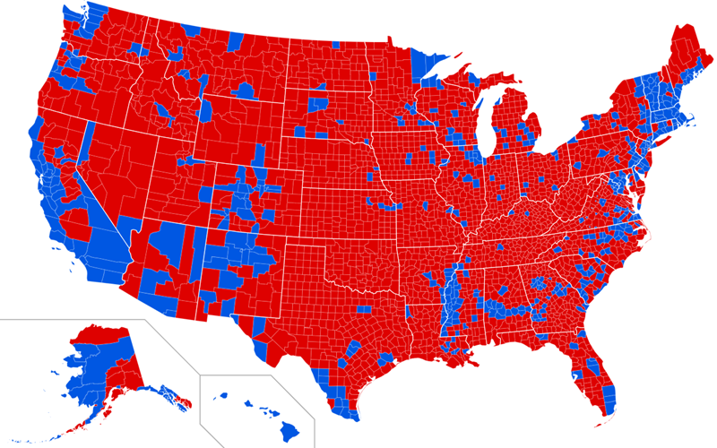
However, it is this at-a-glance aspect that may lead to misleading interpretations of voting outcomes. For example, the distribution of partisan cohorts is typically divided by densely populated urban areas, and sparsely populated rural areas in the United States (and many other western countries), or may vary according to predominate racial groups like the Black Belt across the southern United States, in which the population is a majority African-American.
In Figure 6 the results of the 2020 election are visualized at the county level in a binary code (red = Republican majority vote, blue = Democratic majority vote). While this can show some useful patterns and reveal something about the political sympathies of voters in certain areas, this type of map has been criticized for not being representative of the actual population distribution. So for example, the county boundaries in the figure are arbitrary for the most part and each county can have significant variation in the number of people living in it. These criticisms are summarized in the slogan “Land doesn’t vote,” meaning that cartographic representations of voting outcomes should reflect more the populations voting and not the areas where they live.
Several approaches have been proposed to more faithfully represent voting outcomes. Foremost of these is the cartogram (see Cartogram), which can take many different forms, but generally represents territory abstractly, and instead emphasize another quantitative variable like population.

In Figure 7 a cartogram of election results emphasizes the proportion of voters’ preference for a candidate. Major urban areas like New York City can be seen in the Northeast, Chicago in the north-central and Los Angeles and San Francisco on the west coast, while the rural counties seen in Figure 6 can be seen in the interior of the country. The distorting effect is a result of population density, with denser populations in the urban areas.
Whether this is more effective is debatable, but the vast expanse of red counties in Figure 6 is reduced in its visual impact, and arguably invites more engagement by the viewer.

Figure 8 is another example of a cartogram where electoral votes are represented as equal-sized squares, though each state occupies roughly the same place reactive to other states. Similar to Figure 7, this cartogram reduces the visual impact of the choropleth map, while retaining the generalized spatial characteristics of voting patterns.
Government and Policy
As part of the basic governmental function of administering territory, GIS has become a fundamental component of management, public policy development, implementation, and assessment in local and state government.
GIS figures prominently in the planning and management of utilities and services, ensuring that communities are safe and enjoy reliable and orderly infrastructure, and clean environments. Using demographic or economic data from the U.S. Census and data collected by local and state governments about crime, health, community assets, transportation or other infrastructure, policy- and law-makers can identify areas for specific interventions. Crime mapping involves identifying the spatial characteristics of crimes by type, time of day and community characteristics like the presence of liquor stores, or lack of community centers. Overlaying these spatial data allows decision makers to see concentrations of criminal activity and propose mitigating interventions like increased policing or more community resources like youth centers.
Public transit authorities can use census data to understand the variations in population density, transportation modality selection of commuters, and centers of business and other employment venues to effectively plan and implement transit lines and schedules.
Similarly, Emergency management services rely on GIS to locate or manage resources like firehouses, police stations and other community assets to ensure that these services are maximally responsive to the most people.
GIS and public health have shared antecedents in Dr. Snow’s Cholera map, and GIS is widely used in disease monitoring and tracking and can be used to determine environmental factors influencing health, like spatial correlations between asthma and pollution or monitoring noise pollution in residential areas or water quality throughout a community.
GIS also plays an elemental role in the assessment and evaluation phase of policy-making. Governments monitor the outcomes of various initiatives and can evaluate their impact at different scales and across various demographics. For example, the effectiveness of a housing policy can be evaluated across several dimensions including changes in housing density, demographic shifts, and access to services and other resources using GIS.
GIS is also used by governments for tax assessments and property record keeping, a routine derived from historical practices of cadastral surveys and plat mapping. A cadastre is a description of a survey of land usually in text, describing the location of a parcel of land, its dimensions and any improvements (buildings) on it. A plat is a cartographic representation of a property parcel, which may also contain cadastral information like the size of the parcel. Historically these were drafted by hand, though GIS facilitates very accurate representation and location of property lines and can contain cadastral information as part of a broader database management system.

Smart Cities
Smart cities are an emerging trend in urban planning and policy. “Smart City” refers to a system of collecting data and integrating it into automated decision making and predictive models for utility and infrastructure management (Helegoua, 2020) with the goal of increasing resource sustainability, management efficiency and overall quality of life. Some examples of Smart City technologies include the same systems typical management by cities such as transit and transportation density, public-health monitoring, and utility management, though the management aspect is expanded to include more precise geo-location of resources and real-time monitoring of resource allocation and utilization. The extensive cyber- and information infrastructure requirements of smart cities translate to a need for highly-qualified staff to plan, implement and monitor these systems, as well as the creation and upkeep of the physical infrastructure of sensors and communication systems (Haque, Bhushan and Dhiman, 2022).
Many aspects of smart cities are already present in many urban environments, though the intensive data collection component of smart systems raises issues about the challenges to privacy overreach in government surveillance. Smart City monitoring and data storage systems are vulnerable to data breaches and hacking (Zhang et al. 2017).
The issue of government surveillance is a perennial one, and will require justification by policy- and law-makers for the use of these systems and demonstrate transparency in smart city systems procurement and management along with robust public participation in decision making and accountability.
Historical Policy Analysis
Just as GIS is being used to plan and realize the potential of Artificial Intelligence and automated systems in policy and urban planning, it can also be used to explore and understand how communities have been shaped by historical policies and attitudes, and social and economic disparities that persist into contemporary society.
Redlining is an example of how institutional policies can enforce racial segregation and economic disparity. Originating in the 1930s, redlining involved the practice of denying mortgages or loans to people based on their location, disproportionately affecting African-American families and other minorities in the United States.
The word "redline" comes from an actual red line used to demarcate certain neighborhoods as "high-risk" or undesirable on maps, and so justify preventing residents in these areas from accessing necessary capital to buy or improve homes, and as a result stifle social mobility and economic improvement. However not all redlining maps use this feature and the meaning of the word has been extended to include the general practice of targeting certain neighborhoods for discriminatory mortgage practices (Rothstein, 2017).

Figure 10 above shows a redlining map of Baltimore, Maryland where neighborhoods are characterized using a color-code: first grade in blue, second grade in green, third grade in yellow and fourth grade in red. These patterns conform to spatial distribution of economic and racial variables, with African Americans and immigrants being concentrated around the Central Business District (in the red and yellow areas) and wealthier neighborhoods of the urban periphery (green and blue).

In Figure 11 above the distribution of areas in Baltimore City today with majority African-American neighborhoods follow a similar pattern as the redlining map from 1937, especially in the area around the Central Business District. However, increased access to housing and mortgages have expanded social mobility of African Americans to areas rated as high grade in the north east and north west areas of the city.
A related phenomenon is “reverse-redlining” in which minority populations were freely given mortgages with unfavorable terms and resulted in high default rates, especially during the housing crisis of 2008-9, ultimately continuing a trend of restricting housing to certain populations.
Analyses of historical practices like redlining and the resulting legacies can assist policy makers in rectifying the influence of these discriminatory practices and inform new policies to prevent discrimination in the future.
Political GIS in International Relations
International relations provide a very productive venue for using GIS to understand territorial claims, resource management and economic zones, opportunities for international collaboration and resolving disputes. GIS is often integrated with allied geospatial technology like GPS and remote sensing to capture the most current data, giving decision makers the precise positions and visualizations of past, present and emerging regional events.
The South China Sea is an economically productive area, providing resources to several countries surrounding it like the Philippines, Malaysia, Brunei, Vietnam and the People’s Republic of China and Taiwan (the Republic of China) all of which have competing interests within it. Recently these have escalated to territorial disputes and low-level military altercations centered principally on the Spratly Islands, an archipelago amounting to about 500 acres in area though spread over several hundred square miles in the middle of the South China Sea. The People’s Republic of China has been reinforcing its claims to the Spratleys and other island groups like the Paracels within the South China sea by creating new islands and expanding the landmass of other islands by depositing sediment (Gao and Jia, 2013).
The territorial claims of the People’s Republic of China and Taiwan, (which both claim each other as well) epitomized cartographically by the "Nine Dash Line" (or in some sources the Eleven Dash Line).

Figure 12 shows the Nine Dash line representing both China’s claims to the South China sea. Continual disputes between the People’s Republic of China and the Philippines, was brought to arbitration by the United Nations Convention on the Law of the Sea who decided that China’s claims infringed on the exclusive economic zone of the Philippines’ maritime waters, resulting in China clarifying its position on claims in the South China Sea, and possibly leading to a de-escalation of the dispute (Chubb, 2016).
In disputes like that in the South China Sea, and many other international interactions, geospatial technologies are important tools in defining and managing geopolitical activities such as exclusive economic zones (EEZs), territorial claims, and landmass expansions. They provide precise geographic data required for mapping EEZs, which extend up to 200 nautical miles from the coast and require careful demarcation to avoid overlaps with neighboring territories. These technologies are also important for delineating other territorial claims, especially in regions with ongoing disputes, by creating detailed maps based on historical data and geographic features.
References
- Boschma, J., Rigdon, R., Manley, B., & Cohen, E. (2022, November 8). Maryland redistricting 2022: Congressional maps by district. CNN.
- Buisseret, D. (1992). Monarchs, ministers, and maps in France before the accession of Louis XIV in Monarchs, Ministers, and Maps: the Emergence of Cartography as a Tool of Government in Early Modern Europe [David Buiseret, Ed.]. Chicago : University of Chicago Press.
- Caesar, J. (1904) Cæsar's Commentaries on the Gallic War. Literally translated. Boston: Lee & Shepard, Publishers
- Chafee Jr., Z. (1929). Congressional Reapportionment. Harvard Law Review, 42(8), 1015–1047.
- Chubb, A. (2016). Did China just clarify the nine-dash line? East Asia Forum. Last accessed 6 March 2025.
- Coppock, J. T. & Rhind, D. W. (1991). The History of GIS. In Geographical Information Systems: Principles and Applications, edited by D. J. Maguire, M. F. Goodchild, and D. W. Rhind, 21–43. London: Longmans Publishers.
- Gao, Z., & Jia, B. B. (2013). The Nine-Dash Line in the South China Sea: History, Status, and Implications. The American Journal of International Law, 107(1), 98–123.
- Haque, A. K. M. B., Bhushan, B., & Dhiman, G. (2022). Conceptualizing smart city applications: Requirements, architecture, security issues, and emerging trends. Expert Systems, 39(5).
- Lavalle, P., Mcconnell, H., & Brown, R. G. (1967). Certain Aspects Of The Expansion Of Quantitative Methodology In American Geography. Annals of the Association of American Geographers, 57(2), 423–436.
- Martin, G. H. and Williams, A. (Eds.). (2003). Domesday Book: A Complete Translation. London: Penguin Books.
- Rothstein, R. (2017). The Color of Law. New York: Liveright Publishers.
- Thiessen, M. (2012, November 12). Obama's 'Moneyball' Campaign. Opinion piece, Washington Post.
- United States Census Bureau. (n.d.). About Congressional Apportionment. Last accessed 6 March 2025.
- Warrington, G. S. (2019). A comparison of partisan-gerrymandering measures. Election Law Journal: Rules, Politics, and Policy, 18(3), 262-281.
- Zhang, K., Ni, J., Yang, K., Liang, X., Ren, J., & Shen, X. S. (2017). Security and Privacy in Smart City Applications: Challenges and Solutions. In IEEE Communications Magazine (Vol. 55, Number 1, pp. 122–129).
Learning outcomes
-
1798 - Describe the concept of territory and its relation to human activity and government control, and how it is different from a space.
Describe the concept of territory and its relation to human activity and government control, and how it is different from a space.
-
1799 - Summarize how GIS can be used by political campaigns in “Get Out The Vote” (GOTV) initiatives, and by local municipalities to encourage unregistered voters to participate in the election process.
ummarize how GIS can be used by political campaigns in “Get Out The Vote” (GOTV) initiatives, and by local municipalities to encourage unregistered voters to participate in the election process.
-
1800 - Explain what techniques local municipalities use in GIS to identify accessible voting poll locations and drop boxes.
Explain what techniques local municipalities use in GIS to identify accessible voting poll locations and drop boxes.
-
1801 - Explain gerrymandering and its history, approaches to identifying it, how it can be mitigated, and some limitations on mitigating strategies.
Explain gerrymandering and its history, approaches to identifying it, how it can be mitigated, and some limitations on mitigating strategies.
Related topics
- [AM-02-098] Boundaries and Zone Membership
- [DA-036] GIS&T and Public Policy
- [FC-07-026] Problems of Scale and Zoning
- [GS-02-020] Aggregation of Spatial Entities and Legislative Redistricting
- [GS-02-026] Mapping Spatial Justice for Marginal Societies
Additional resources
- Election Assistance Commission “GIS and Elections Quick Start Guide", https://www.eac.gov/sites/default/files/electionofficials/QuickStartGuides/GIS_Elections_EAC_Quick_Start_Guide_508.pdf
- Esri's Map voter data to plan your campaign, an Intermediate level GIS activity, https://learn.arcgis.com/en/projects/map-voter-data-to-plan-your-campaign/
- U.S. Census Bureau Voting and Registration Information, https://www.census.gov/topics/public-sector/voting.html