[CV-06-022] Map Interpretation
Maps, just like text, paintings, and other media, are open to interpretation. Map interpretation describes the process of extracting meaning from a map to make sense of the real world. To arrive at an interpretation of the real world, an individual must reconcile their mental model of the world with that of the cartographer’s through the map. Because everyone has a different mental model of the world, a single map can connote a variety of meanings, and therefore, be interpreted differently. Cartographers can prime individuals to interpret a map in a particular way through selection, classification, symbolization, and other cartographic tools in the map design process. However, individual differences like beliefs and knowledge ultimately dictate the meaning someone forms from a map. Equally important to the formation of meaning is questioning the meaning of the map. Questioning the meaning considers why patterns or relations are a certain way and whether they should be trusted. Information is more contested than ever, so understanding a map is one thing, trusting it is another. In seeking out explanations for what is shown on a map, one can better understand the world around them.
Tags
Author & citation
Prestby, T. (2025). Map Interpretation. The Geographic Information Science & Technology Body of Knowledge (Issue 2, 2025 Edition), John P. Wilson (Ed).. DOI: 10.22224/gistbok/2025.2.19.
Explanation
Map interpretation describes the process of extracting meaning from a map to make sense of the real world. To arrive at an interpretation of the real world, an individual must reconcile their
The dynamism of
Interpretation is complicated because maps do not exist in a vacuum—they are inextricable from the sociopolitical contexts in which they are created and consumed Interpretation usually draws on existing knowledge and additional sources of information (e.g., another map, an article) to augment what is shown on the map.
This account of map interpretation highlights major phenomena that shape map interpretation. Here, map interpretation is broken down in two major steps: forming the meaning and questioning the meaning. Forming the meaning involves the numerous processes that go into what meaning someone gleans from a map. These processes include the role that cartographers and the cartographic design process play in shaping meaning before exploring frameworks and filters that people use when processing new information.
Once someone comes to their own explanation of the map’s meaning, then they must decide what to do with it. This is the second step: questioning the meaning. Questioning takes the form of seeking explanations for patterns and relationships found on maps and determining whether or not to trust maps.
Forming the meaning initially precedes questioning the meaning. However, this process is cyclical and can loop in many directions.
2. Forming the Meaning
2.1 External Factors
Cartographers and Cartographic Design
Cartographers have more control over shaping the readers’ interpretation of a map in some cases versus the other. MacEachren’s (1994) Cartography3, which expands upon the SWOOPY framework proposed by DiBiase (1990), suggests that maps exist on a continuum ranging from visual thinking to visual communication (See Geovisualization, Çöltekin et al. 2018). More exploratory maps that are geared towards scientific exploration and visual thinking offer greater possibilities for interaction. At the other end of the spectrum are maps geared towards scientific communication. These maps generally constrain interaction and are focused on presenting known insights to their readers.
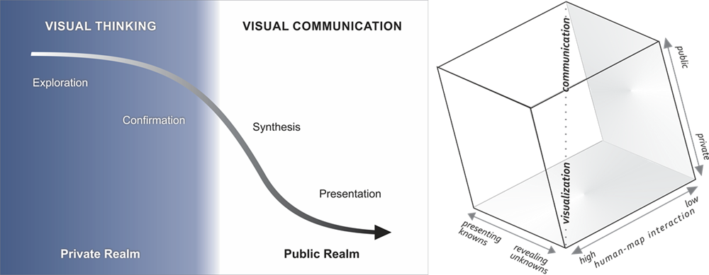
Exploratory maps are more open-ended when it comes to interpretation as they act as a catalyst for readers to derive new insight about phenomena. The cartographer is usually more so a programmer/developer in these cases whose goal is to provide as much information via multiple datasets, time periods, scales, etc. as possible so that the reader can generate new insight. Presentation maps generally attempt to communicate a message as the
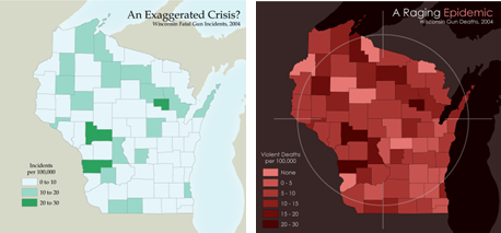
Both maps are created from the same data but tell very different stories (see Aesthetics and Design, Nestel 2019). The first map makes it seem that gun violence is not a major issue using pastel greens and by organizing most of the data into bins with light colors. The second map is alarmist in nature and calls attention to the issue of gun violence. It achieves this by using a color scheme with all dark, saturated reds with many classes. It adds a crosshair as an embellishment as well. In both cases, the cartographer has made deliberate design choices to emphasize a particular message. The titles of the maps are also slants in that they create a particular impression of an issue that prime readers to interpret the meaning of the map a certain way.
Empirical evidence suggests that color use and titles can shape visualization interpretation. Anderson and Robinson (2021) examined how the affective congruency, the degree that a color scheme aligns with the emotional undertone of a mapped topic, influences interpretation. Maps with affectively congruent color palettes (e,g., dark colors applied to a homicide map) heightened participant’s emotions compared to affectively incongruent color palettes (e.g., bright, playful colors applied to a homicide map). This was especially the case for positive topics like nature. Affectively incongruent maps also caused confusion among participants. Kong et al. (2018) found that people heavily relied on slanted visualization titles to perceive the message of a visualization. A follow-up study revealed that visualization titles can produce confirmation biases in interpreting information: people were more likely to dismiss the message when the title was inconsistent with an individual’s attitudes toward a topic.
While
2.2 Internal Factors
Humans use mental frameworks to help organize and interpret information. In this section we highlight two factors that shape meaning derived from maps: cognitive biases and existing knowledge.
Cognitive biases are systematic patterns of reasoning that skew perception and decision-making. Namely, confirmation bias means that people tend to derive meaning from information that aligns with their existing beliefs. Fish and Kreitzberg (2023) note that conservative news outlets often misuse maps to support their arguments about climate change denial. In one case, a map actually provides compelling evidence of climate change, but the news outlet strips context away from the map and uses rhetorical strategies such as framing to falsely claim that the map delegitimizes climate change. The map taken out of context is shown below:
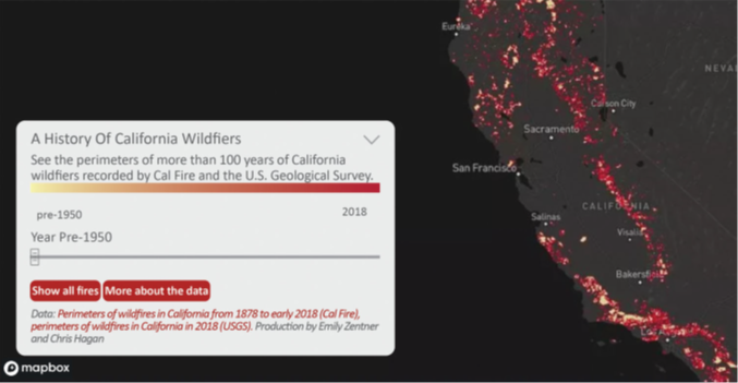
The article by RedState (Morse, 2019) shows a screenshot nearly identical to this one of an interactive map designed to visualize fires from 1878-2018. The screenshot bars people from interacting and seeing how fires have changed over time. The author also uses the seeming abundance of pre-1950 fires to argue that wildfires have always been around and are not getting worse. This exemplifies confirmation bias. The map is interpreted in a way that aligns with the conservative media’s beliefs about climate change. Other research suggests that people with stronger prior beliefs about a topic are more likely to maintain said belief after viewing a story map on that topic (Song et al., 2022). However, people who found the topic worth discussing were more open to changing their beliefs, suggesting that certain individuals may be less swayed by confirmation bias.
New information must be understood (i.e., interpreted) using mental scaffolding built from existing ideas and known truths, which is commonly conceived of as knowledge (Pritchard, 2013). Knowledge therefore acts as a filter of sorts when interpreting maps as it can only be understood in terms of existing (known) concepts.
3.1 Asking Why
Map interpretation is commonly conceptualized as “an effort to understand why geographic features are found where they are and comprehend the spatial relations they exhibit” (Kimerling et al., 2016). In understanding the why of what is shown on a map, people can perceive more vibrant meanings of geographic phenomena. These lines of inquiry can be temporal, spatial, and/or thematic in nature. While maps usually capture a single snapshot in time, this snapshot might prompt someone to ask, how did the current patterns come to be? Such patterns can be of the physical environment (e.g., geological processes), the human landscape (e.g., demographics), and the physical-human interactions (e.g., land use). Regardless of the nature of the map, interpretation offers explanations for what is going on.
3.2 Trust
Once someone derives a particular meaning or set of meanings from a map, that meaning can go in different directions. Whether someone believes the meaning is dictated by trust. Map trust describes someone’s willingness to rely on the understanding they glean from a map (Prestby, 2025). With this reliance comes an assumption that the map is worthy of trust; that is, the map is correct and not going to cause negative outcomes. While meaning formation describes the inferences someone extracts from a map, trust refers to the actual and perceived veracity of the inferences. It is possible, then, for someone to understand what a map is showing, but not trust it.
Map trust is shaped by many of the same factors that influence meaning formation including prior beliefs and additional knowledge. It is also shaped by the ability to process information (e.g., time constraints, amount of information provided) and more situational factors such as one’s motivation (Prestby, 2025).
Motivation is often operationalized as issue involvement: how much someone cares about a particular topic (Prestby, 2025). Issue involvement has been found to influence how deeply someone processes information. High motivation is associated with deeper thinking and intensive reasoning whereas low motivation is associated with low effort, quick decisions. Someone who is highly involved, may scrutinize a map more and come to a wider range of and potentially more nuanced understandings on what a map shows. They may also be more aware of a map’s faults and trust it less. Conversely, lower motivation can encourage the reliance on mental shortcuts called heuristics that people use to reduce their cognitive load (Prestby, 2025). Think of heuristics as rules of thumb such as “I can trust this map because it looks vivid (the realism heuristic). Heuristics and heuristic processing are generally linked to greater trust, though there are cases where heuristics could lead to lower trust (e.g., a map was made by an organization I do not trust, so I do not trust it).
3.3 Reactance
Psychological reactance can also play a role in map interpretation. Reactance describes the tendency for people to reject a particular message because they perceive a threat to their freedom of choice (Prestby, 2025). Essentially, when people can tell they are in the crosshairs of persuasion, they will have an adverse reaction. Maps often function as persuasive devices. By extension of reactance theory, people may be less likely to accept the meaning of a map if it feels like persuasion. Blatantly propagandist maps were trusted significantly less than their more authoritative-looking and scientific counterparts (Muehlenhaus, 2012).
3.4 Truth-Default
Truth-default theory (TDT) suggests that people’s default tendency is to trust something, but certain events can lead to an erosion of this trust (Levine, 2014). TDT emphasizes that one’s ability to detect deception in communication content is predicated on evaluating the context in which communication occurs. In evaluating the communication content and/or context, one may encounter a trigger event that raises their suspicion. This may shift an individual out of the
References
- Anderson, C. L., & Robinson, A. C. (2021). Affective Congruence in Visualization Design: Influences on Reading Categorical Maps. IEEE Transactions on Visualization and Computer Graphics, 1–1. IEEE Transactions on Visualization and Computer Graphics.
- Buckley, A. R., and Kimerling, A. J. (2021). Map Reading. The Geographic Information Science & Technology Body of Knowledge (1st Quarter 2021 Edition), John P. Wilson (Ed.).
- Capradio. (n.d.). California Wildfire History Map. Produced by Liz Anderson, Emily Zentner, Veronika Nagy.
- Çöltekin, A., Janetzko, H., and Fabrikant, S. I. (2018). Geovisualization. The Geographic Information Science & Technology Body of Knowledge (2nd Quarter 2018 Edition), John P. Wilson (Ed)
- Crampton, J.W. (2001). Maps as social constructions: power, communication and visualization. Progress in Human Geography, 25(1), 235-252.
- DiBiase, D. (1990). Visualization in the Earth Sciences. Earth and Mineral Sciences, Bulletin of the College of Earth and Mineral Sciences, Pennsylvania State University, 59, 13-18.
- Fish, C. S., & Kreitzberg, K. Q. (2023). Mapping in an Echo Chamber: How Cartographic Silence Frames Conservative Media’s Climate Change Denial. Annals of the American Association of Geographers, 113(10), 2480–2496.
- Griffin, A. (2021). Cartography and Science. The Geographic Information Science & Technology Body of Knowledge (1st Quarter 2021 Edition), John P. Wilson (Ed.).
- Kent, A. J. (2018). Form follows feedback: Rethinking cartographic communication. Westminster Papers in Communication and Culture, 13(2), 96-112.
- Kimerling, A. J., Buckley, A. R., Muehrcke, P. C., & Muehrcke, J. O. (2016). Map Use: Reading, Analysis, Interpretation (8th ed.). Redlands, CA: Esri Press.
- Kong, H.-K., Liu, Z., & Karahalios, K. (2018). Frames and Slants in Titles of Visualizations on Controversial Topics. Proceedings of the 2018 CHI Conference on Human Factors in Computing Systems, 1–12.
- Levine, T. R. (2014). Truth-Default Theory (TDT): A Theory of Human Deception and Deception Detection. Journal of Language and Social Psychology, 33(4), 378-392.
- Ly Toong Yi, P. (2024). Trust in Maps: Investigating the Role of Cognitive Biases [Thesis]. University of Twente.
- MacEachren, A. M. (1994). Visualization in Modern Cartography: Setting the Agenda. In: A. M. MacEachren & D. R. F. Taylor (Eds.), Visualization in Modern Cartography (pp. 1-12). Oxford, England: Pergamon.
- Muehlenhaus, I. (2012). If Looks Could Kill: The Impact of Different Rhetorical Styles on Persuasive Geocommunication. The Cartographic Journal, 49(4), 361-375.
- Nestel, C. (2019). Aesthetics and Design. The Geographic Information Science & Technology Body of Knowledge (1st Quarter 2019 Edition), John P. Wilson (Ed.).
- Pickles, J. (2011). Texts, Hermeneutics and Propaganda Maps. In The Map Reader (pp. 400–406). John Wiley & Sons, Ltd.
- Prestby, T. J. (2025). Situating Trust in Cartography: Why do People Trust Maps and What does Trust in Maps Mean?. Cartographic Perspectives, (106), 10–27.
- Pritchard, D. (2013). What is this thing called Knowledge? (3rd ed.). Routledge.
- Rock, A. E. (2024). Map Analysis. Geographic Information Science & Technologies Body of Knowledge (2024 Edition). John P. Wilson (Ed.)
- Song, Z., Roth, R. E., Houtman, L., Prestby, T., Iverson, A., & Gao, S. (2022). Visual Storytelling with Maps: An Empirical Study on Story Map Themes and Narrative Elements, Visual Storytelling Genres and Tropes, and Individual Audience Differences. Cartographic Perspectives, (100), 10–44.
- Thatcher, J. (2018). Cartography and Power. The Geographic Information Science & Technology Body of Knowledge (1st Quarter 2018 Edition), John P. Wilson (ed).
- Tyner, J. A. (1982). Persuasive Cartography. Journal of Geography, 81(4), pp. 140–144.
Learning outcomes
-
1969 - Explain key factors influencing how people interpret maps.
-
1970 - Describe how cartographers can intentionally and unintentionally shape a map’s message.
-
1972 - Compare internal factors and external factors that influence map interpretation.
-
1973 - Evaluate a map's trustworthiness by applying concepts such as truth-default theory and psychological reactance.
-
1974 - Formulate insightful questions about a map to understand the "why" behind geographic patterns, including their temporal, spatial, and thematic relationships.
-
1975 - Differentiate between how meaning is formed and how meaning is questioned when interpreting maps.
-
1977 - Recognize the importance of trust in map interpretation.
Related topics
- [CV-01-026] Cartography and Power
- [CV-06-021] Map Reading
- [CV-06-023] Map Analysis
- [FC-03-020] The power of maps
Additional resources
- Bertin, J. (2010). Semiology of graphics: Diagrams, networks, maps. California: Esri Press.
- Chaiken, S. (1989). Heuristic and Systematic. Unintended Thought, 212.
- Crampton, J. (2010). Mapping: A Critical Introduction to Cartography and GIS. Chichester, UK: Wiley-Blackwell.
- Griffin, A.L., White, T., Fish, C., Tomio, B., Huang, H., Sluter, C. R., Bravo, J. V. M., Fabrikant, S. I., Bleisch, S., Yamada, M., and Picanço, P. (2017). Designing across map use contexts: A research agenda. International Journal of Cartography, 3(Sup1), 61-89.
- Harley, J. B. (1988). Maps, knowledge, and power. In D. Cosgrove, & S. Daniels, (Eds.), Iconography of landscape: Essays on the symbolic representation, design and use of past environments, (277-311). Massachusetts: Cambridge University Press.
- Kent, A. J. (2018). Form follows feedback: Rethinking cartographic communication. Westminster Papers in Communication and Culture, 13(2), 96-112.
- Lang, A. (2000). The limited capacity model of mediated message processing. Journal of communication, 50(1), 46-70.
- MacEachren, A. M. (1995, 2004). How Maps Work: Representation, Visualization, and Design. New York, New York: Guilford Press. Paperback edition (2004).
- Monmonier, M. S. (1996). How to lie with maps (2nd ed.). Illinois: University of Chicago Press.
- Sundar, S. S. (2008). The MAIN model: A heuristic approach to understanding technology effects on credibility. MacArthur foundation digital media and learning initiative.