[CV-05-040] Mobile Maps and Responsive Design
Geographic information increasingly is produced and consumed on mobile devices. The rise of mobile mapping is challenging traditional design conventions in research, industry, and education, and cartographers and GIScientists now need to accommodate this mobile context. This entry introduces emerging design considerations for mobile maps. First, the technical enablements and constraints that make mobile devices unique are described, including Global Positioning System (GPS) receivers and other sensors, reduced screensize and resolution, reduced processing power and memory capacity, less reliable data connectivity, reduced bandwidth, and physical mobility through variable environmental conditions. Scholarly influences on mobile mapping also are reviewed, including location-based services, adaptive cartography, volunteered geographic information, and locational privacy. Next, two strategies for creating mobile maps are introduced—mobile apps installed onto mobile operating systems versus responsive web maps that work on mobile and nonmobile devices—and core concepts of responsive web design are reviewed, including fluid grids, media queries, breakpoints, and frameworks. Finally, emerging design recommendations for mobile maps are summarized, with representation design adaptations needed to account for reduced screensizes and bandwidth and interaction design adaptations needed to account for multi-touch interaction and post-WIMP interfaces.
Tags
Author and citation
Ricker, B., and Roth, R. E. (2018). Mobile Maps and Responsive Design. The Geographic Information Science & Technology Body of Knowledge (2nd Quarter 2018 Edition), John P. Wilson (Ed). DOI:10.22224/gistbok/2018.2.5.
Explanation
- Definitions
- Introducing Mobile Mapping
- Mobile Map Development
- Mobile Map Design
adaptive cartography: map designs that change based on different use and user contexts
breakpoint: a viewport width that triggers conditional content, layout, and styling, selected to capture different device categories
egocentric map view: a map that is centered on the user’s location and reoriented so that “forward” not necessarily “north” is “up”
fluid grid: an interlocking set of horizontal rows and vertical columns in a webpage responsively sized based on relative percentages
location-based service: applications that customize maps and information based on the user’s current location
location privacy: the protection of personal spatial information from public communication without permission
media query: a CSS rule that detects characteristics of the viewing device, which can be used for responsive content, layout, and styling
mobile device: a computing system small enough to be held in hand, such as a smartphone or tablet
mobile app: a software program installed on a mobile operating system
mobile map: a cartographic representation or mapping application explicitly designed for viewing and interaction on a digital, handheld, and moveable computing device
mobile-first design: a design approach that begins with small-screen viewing and multi-touch post-WIMP (windows, icons, menus, and pointer) interactions and then expands the design solution to larger screens and external input devices
multi-touch interaction: devices that enable simultaneous user input from multiple fingers to detect a wide range of hand gestures
point of interest (POI): sites in the landscape that meet user-defined needs or interests
post-WIMP interface: an interface that extends beyond the workstation WIMP (windows, icons, menus, and pointer) metaphor that is characterized by inclusion of multimodal input, novel input devices, or natural interface metaphors
rich internet applications (RIAs): a software program that relies on heavy-weight, browser-based plugins (e.g., Adobe Flash Player)
responsive design: a set of strategies for using the Open Web Platform that dynamically change the content, layout, and styling of a webpage based on the display device and user context
responsive design framework: code libraries that simplify responsive design by managing fluid grids, media queries, and viewport breakpoints
viewport: the display area in pixels available for rendering a website
volunteered geographic information: spatially-explicit, crowdsourced information
2.1 Mobile technology and society
Geographic information increasingly is produced and consumed on mobile devices (Muehlenhaus 2013). A mobile device is a computing system small enough to be held in hand, such as a smartphone or tablet (Meng et al. 2005). While laptops often are considered as mobile devices given their portability, smartphones and tablets present a new design context for cartographers and GIScientists given presumed mobility during use. Such mobile devices deliver maps and information as the user crosses the landscape, supporting navigation and providing local context while potentially splitting attention away from hazards in the environment. Accordingly, a mobile map is a cartographic representation or mapping application explicitly designed for viewing and interaction on a digital, handheld, and moveable computing device (Roth et al. 2018).
Mobile devices have become so pervasive that they are almost invisible (Satyanarayanan, 2001) and so too are the mobile maps and geographic information systems that drive much of the uptake of mobile devices (Sui 2005). One market study indicated that global ownership of mobile devices surpassed desktop devices in 2014, and found that maps are used roughly twice as often on mobile devices than non-mobile counterparts (Lella and Lipsman 2014). A second study suggested that nearly two-thirds of American adults owned a smartphone by 2015, and found maps and navigation to be a top-ten most common use of smartphones (Smith et al. 2015). Whether or not these estimates accurately characterize the degree to which mobile maps have assimilated into society, it is clear that the rise of mobile mapping is challenging traditional design conventions in research, industry, and education, and that cartographers and GIScientists increasingly need to accommodate this mobile context (Wilson 2012). This entry introduces emerging design considerations for mobile maps.
2.2 What is unique about mobile technology for cartography and visualization?
While paper maps are inherently mobile, digital devices present both new opportunities for and constraints on cartography and visualization. Mobile devices are equipped with GPS (see Global Positioning System), wireless and Bluetooth receivers, an accelerometer, and other sensors that can be used to tailor maps and information to the user’s context (Meng et al. 2005). However, mobile devices have reduced screen size and (until recently) screen resolution, reduced processing power and memory capacity, less reliable data connectivity, and reduced bandwidth (Chittaro 2006), often rendering designs that work on paper or non-mobile devices ineffective for mobile. Mobile devices also rely on multi-touch input, enabling natural user interactions while requiring post-WIMP (windows, icons, menus, pointer; details below) map interfaces (see UI/UX Design).
Beyond the device, the user’s physical mobility also influences the need for unique design considerations of mobile maps. The mobile device can focus, but also divide, user attention when moving through the landscape, resulting in gaps of awareness and judgment. Environmental factors such as sunlight, extreme temperatures, precipitation, wind, noise, and congestion produce variable viewing and interaction conditions, making designs less reliable across conditions (Reichenbacher 2001). Accordingly, promoting personal safety is an essential consideration for mobile map design and use (Roth et al. 2018).
2.3 Scholarly influences on mobile mapping in GIScience
Research on mobile mapping remains in its infancy. However, there are a number of related research areas across Geographic Information Science & Technology that offer insight into mobile map design:
- Location-based services (LBS) are applications that customize maps and information based on the user’s current location (see Location-based Services). For mobile mapping, LBS enable an egocentric view with the map centered on the user’s location and reoriented so that “forward” not “north” is “up” (Meng 2005). LBS also support turn-by-turn navigation, facilitating wayfinding while potentially influencing our spatial awareness (Klippel et al. 2010).
- Adaptive cartography describes map designs that change across different use and user contexts (Reichenbacher 2003, Griffin et al. 2017). While the user’s location and device are two aspects of context relevant for mobile map design, adaptive cartography also considers individual user differences, the surrounding environment, and the mapping activity (Griffin et al. 2017). Adaptive cartography is converging with responsive web design (discussed below) as maps need to work across mobile and non-mobile use contexts.
- Volunteered geographic information (VGI) is spatially-explicit, crowdsourced information, such as geotagged tweets (see Volunteered Geographic Information, forthcoming). Mobile devices enable users to volunteer their local knowledge and lived experience while situated in place, providing timely but unstructured information about changing geographic conditions. VGI often is used to populate the data streams offered through LBS, producing a cyclical relationship facilitated by mobile maps (Ricker et al. 2014).
- Locational privacy describes the protection of personal spatial information from public communication without permission (see Location Privacy). Many mobile maps capture location to adapt and improve the user experience, and those that leverage LBS and enable VGI run the risk of disclosing private location information. While creative techniques have been developed to preserve anonymity (e.g., Karlsson & Wicker 2016), mobile users also are increasingly willing to share their location in return for a service (Ricker et al. 2015). Users post different content based on their location and perceived safety (Fitzpatrick et al. 2015), with locational privacy remaining an important concern in all mobile mapping projects.
3.1 Mobile apps versus responsive websites
Arguably, the mobile revolution in the late 2000s and early 2010s was as transformative for map design as the digital revolution was in late 1980s and early 1990s (see Cartography & Technology). Support for mobile devices was a primary factor in the move away from rich internet applications (RIAs) for digital maps that relied on heavy-weight, browser-based plugins (Roth et al. 2014).
Today, there are two strategies for developing mobile maps. The first is creation of mobile apps (short for “application”), or software programs installed on a specific mobile operating system, such as Android (Google devices) and iOS (Apple devices) each offer a their own native wayfinding app (Muehlenhaus 2011; Figure 1). There are a wide range of custom mobile apps that download geographic information and other assets on installation, reducing network reliance and enabling an offline mode. These mobile mapping apps also have direct access to the mobile device’s memory and hardware components, improving processing and interaction speeds. However, mobile apps are platform dependent―requiring parallel development on Android and iOS or use of a cross-platform, third-party software development kit―and restrict non-mobile use―making most mobile apps unavailable on non-mobile devices.
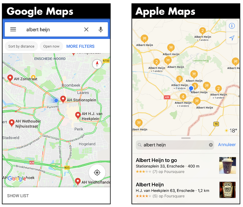
Figure 1. Comparing Mobile Map Apps: Google Maps versus Apple Maps. The images query for the Dutch grocery chain Albert Heijn in Enschede, NL, using the Google Maps (Android) and Apple Maps (iOS) mobile map apps. Map Composition & Layout: Both apps use a majority of the screen real-estate for the map, with Google Maps placing the search input at the top of the layout for responsive design to non-mobile devices (see Figure 2) and Apple Maps placing the search at the bottom of the layout for optimal thumb-based interaction. Google Maps requires the user to “Show List” to explore search results, which activates a dialog window covering the map completely, while Apple Maps enables scroll browsing for searched items in the bottom list, with several items shown as a visual preview. Because of the visual preview, Apple Maps dedicates slightly less of the screen real-estate to the map itself. Scale & Generalization: Google Maps uses a larger default scale (i.e., zoomed in) compared to Apple Maps upon search, a more appropriate searching boundary for finding groceries in the non-automobile-centric European city. Given the smaller default scale (i.e., zoomed out), Apple Maps has a more generalized basemap with substantially less land use and transportation information. Both apps use vector tiling. Projection: Both apps center the map on the user’s current location, indicating the location using a blue dot and current viewing direction using an orientation cue. Symbolization: Apple Maps uses self-explanatory icons for symbolizing its search results, while Google Maps uses a simple marker icon. However, the iconic point symbol is not used when multiple search features are clustered together, with the numerical frequency instead indicated. Given the potential for confusion about the meaning of numbers, an additional label (“+2”, “+3”) is added beneath the clustering symbols, redundantly encoding the information in a manner that uses valuable screen real-estate. Google Maps uses a dark red to symbolize its search results, which contrasts with the basemap more than the Apple Maps uses of gold symbols. Point symbols in both apps are roughly the same size, facilitating finger-based interaction. Typography: Both apps make use of san serif typefaces optimized for mobile viewing. The density of labels is greater on Google Maps, a benefit of the larger default scale. Map Elements: Google Maps provides an indication of north that can be used to rotate the map for egocentric viewing. Google Maps uses a “crosshairs” icon to reposition the map to the user’s location after panning and zooming, while Apple Maps uses an icon that is similar to a north arrow for this functionality, a potential confusion. Neither app indicate scale, an issue that is less of a concern when directions are requested. Interaction: Both apps support mobile first interactions. Both apps privilege the search operator given their emphasis on wayfinding, either for a particular address or location (spatial search) or category of feature (attribute search). The Google Maps interface is slightly more complex, containing additional filtering and overlay features not available in Apple Maps. Taken together, Google Maps more closely follows recommendations from the literature as summarized in Table 1 than Apple Maps. Screenshots captured May 1st, 2018.
The second strategy is creation of a responsive web map. Responsive web design is a set of strategies implemented using the Open Web Platform (see Web Mapping) that dynamically change the content, layout, and styling of a webpage based on the display device and user context (Marcotte 2010; Figure 2). Responsive web maps have the potential for greater access and distribution―given use of the Open Web Platform―and cheaper development―given reliance on existing web mapping competencies and languages and inherent cross-platform and non-mobile support. Thus, responsive mobile websites are recommended when project resources are limited or the target user group includes marginalized populations, populations in developing economies, or non-expert citizens uninterested in expensive apps. However, responsive mapping websites often have slower processing and interaction speeds, require a network connection (and thus potentially expensive data plan), and offer a discontinuous user experience when switching among apps (Roth et al. 2018).
 Figure 2. Google Maps: Mobile vs Non-mobile Responsive Design. The images compare the same Google Maps query of Enschede, NL, on a widescreen laptop (1366 x 768 pixels) versus a typical mobile device (414 x 736 pixels). Map Composition & Layout: The information panel on the left-side of the non-mobile layout is collapsed to a bottom menu for mobile devices that, when activated, opens as a full-screen dialog window atop the map. Scale & Generalization: Despite recommendations from the literature, the non-mobile version actually has a larger default cartographic scale (i.e., zoomed in), having greater basemap detail and label density. Both mobile and non-mobile used a generalized vector basemap by default, with the mobile version including an additional layers button for easy access to the imagery option. The non-mobile version shows an image preview in the information window, while the mobile version includes a Street View preview, assuming the user is situated in the landscape. Projection: While both mobile and non-mobile include a button to search for the user’s current location, the mobile option centers the map on the user’s location by default and updates the user’s position on the map when moving. Symbolization: The multiscale symbolization strategy using interlocking vector tiles keep a largely consistent basemap symbolization across devices.The primary difference is symbolization of the user’s current location with a blue dot in the mobile experience. Typography: The san serif typeface is optimized for mobile and non-mobile viewing, with the text remaining upright when rotating the map on mobile. Map Elements: While a north arrow is not included by default, it is added to the mobile version when rotating or following directions in an egocentric view. Interaction: Google Maps interactions are mobile-first, with important interface buttons (e.g., search location, directions) expanded in size for touch interaction. The search form remains in the highest visual position in both versions, with the more specific search for current location fixed to the bottom-right of the map for easy thumb-based interaction. Importantly, the directions button is repositioned and enlarged for mobile, again facilitating thumb-based interaction. Finally, the mobile version enables voice interaction for search. Browser developer tools allow designers to test their responsive strategy in multiple screen sizes. Screenshots captured May 1st, 2018.
3.2 Responsive design and development concepts
Responsive design is now the standard on the web irrespective of mobile support. However, mobile devices present the greatest constraints on content delivery, layout, and styling. As a general rule, designers begin with small-screen viewing and then expand to larger screens, an approach described as mobile-first design.
There are several core design concepts that enable responsive websites (see Web Mapping for details on HTML, CSS, and JavaScript):
- Fluid Grids: A responsive website is composed of an interlocking set of horizontal rows and vertical columns, called a fluid grid. The column width is based on percentages, with all columns adding to 100% the width of the web browser. By using percentages, rather than exact pixel widths, HTML elements (e.g., a <div> tag) placed within the fluid grid grow and shrink with the columns as they resize across devices, potentially pushing adjacent content into vertically stacked rows.
- Media Queries: A media query is a CSS rule declared in the head (<head>) of an HTML file that detects characteristics of the viewing device, which can be used to set conditional style rules according to the device, particularly its screen size. While media queries return a range of attributes about the viewing device, they primarily are used to determine the viewport dimensions, or the display area in pixels available for rendering a website.
- Breakpoints: Breakpoints trigger conditional style rules based on the viewport width, with breakpoints selected to capture different device categories. Commonly used breakpoints include 320 px or 480 px (smartphone to tablet), 768 px (tablet to laptop), and 1024 px (laptop to external monitor), although conventions adjust with new technology releases.
- Frameworks: While responsive design can be implemented using fluid grids, media queries, and breakpoints alone, there are a growing number of open source code frameworks that simplify responsive design. For instance, the Bootstrap framework (http://getbootstrap.com/) developed by Twitter renders content using twelve equally-sized columns and four breakpoints. The framework then manages the rules for fluid grids, media queries, and breakpoint conditional styling, as well as cross-browser support.
Increasingly, mobile apps include concepts from responsive design given the increasing range of mobile devices for each operating system, blurring the distinction between responsive web design and mobile app development design principles.
4.1 Adapting map design to the mobile platform
Mobile-first design requires cartographers to rethink conventions for both representation and interaction. Table 1 provides a summary of Muehlenhaus’s (2013) discussion of emerging mobile-first recommendations, appended with additional literature collated in Roth et al. (2018). These recommendations follow mobile-first cartographic design, and therefore may be responsive between mobile and non-mobile devices.
| Map Composition & Layout | Constraint | Reference |
| maximize the screen real-estate used for the map view | screensize | Muehlenhaus (2013) |
| use full-screen dialog windows for text & interface menus | screensize | Muehlenhaus (2013) |
| respond to vertical and horizontal aspect ratios | handheld | Chittaro (2006) |
| Scale & Generalization | Constraint | Reference |
| present only task-relevant information | bandwidth; screensize | Meng (2005) |
| generalize basemap | bandwidth; screensize | Meilinger et al. (2007) |
| include salient landmarks for orientation | mobility | Raubal & Winter (2002) |
| increase default map scale (i.e., zoom in) | screensize | van Tonder & Wesson (2009) |
| constrain smallest map scale (i.e., max zoom out) | mobility | Davidson (2014) |
| provide visual affordance for off-screen content | screensize | Chittaro (2006) |
| load map progressively, using tiles | bandwidth | Muehlenhaus (2013) |
| cache essential informatin on load | bandwidth | Roth et al. (2018) |
| use vector tilesets | bandwidth | Buttenfield (2002) |
| Projection | Constraint | Reference |
| center map on user’s location | mobility | Meng (2005) |
| update user’s position on the map | mobility | Peterson (2014) |
| reorient view so that forward is up | mobility | van Elzakker et al. (2009) |
| Symbolization | Constraint | Reference |
| emphasize wayfinding | mobility | Muehlenhaus (2013) |
| use self-explanatory icons for POIs | mobility; screensize | Robinson et al. (2013) |
| increase contrast within visual hierarchy | viewing conditions | van Tonder & Wesson (2009) |
| increase brightness and saturation of map features | viewing conditions | Roth et al. (2018) |
| increase size of interactive point symbols | touchscreen | Stevens et al. (2013) |
| include vector and imagery basemap options | mobility | Davidson (2014) |
| symbolize unsafe crossings or other hazards | divided attention; mobility | Roth et al. (2018) |
| Typography | Constraint | Reference |
| use sans serif fonts | screensize | Muehlenhaus (2013) |
| increase text size and tracking | screensize | Muehlenhaus (2013) |
| divide long sections of text into multi-window blocks | screensize | Muehlenhaus (2013) |
| keep text upright as user rotates map | handheld | Muehlenhaus (2013) |
| Map Elements | Constraint | Reference |
| use loading screen for map title | screensize | Muehlenhaus (2013) |
| hide legend, help, and supplementary info by default | screensize | Muehlenhaus (2013) |
| include persistent north arrow for egocentric view | mobility | Muehlenhaus (2013) |
| allow text and audio options for descriptions/directions | screensize | Davidson (2014) |
| Interaction | Constraint | Reference |
| include post-WIMP widgets only | multi-touchscreen | Muehlenhaus (2013) |
| provide visual affordances for interactive widgets | multi-touchscreen | Stevens et al. (2013) |
| support double-tap and pinch for zoom | multi-touchscreen | Muehlenhaus (2013) |
| support grab-and-drag for pan | multi-touchscreen | Muehlenhaus (2013) |
| support two-finger twist for rotate | multi-touchscreen | Muehlenhaus (2013) |
| eliminate pan arrows and large zoom bar | multi-touchscreen | Muehlenhaus (2013) |
| include +/- zoom buttons to zoom with one hand | multi-touchscreen | Muehlenhaus (2013) |
| enable voice recognition for keying interactions | voide | Muehlenhaus (2013) |
| use sound and vibration for interaction feedback | handheld | Muehlenhaus (2013) |
| allow the user to tap anywhere to close popups | multi-touchscreen | Muehlenhaus (2013) |
| support tap and hold for advanced options | multi-touchscreen | Muehlenhaus (2013) |
| include search for user’s current location | battery; mobility | Roth et al. (2018) |
| include calculate wayfinding routes | mobility | Davidson (2014) |
| support an offline or (for responsive) printable version | bandwidth; battery | Roth et al. (2018) |
4.2 Mobile representation design
Starting with composition and layout (see Visual Hierarchy & Layout), many mobile maps maximize the screen real-estate used for the default map view, placing additional information, map elements, and advanced interactive functions within a small “hamburger” menu button or ribbon, which when activated opens into a dialog window fully covering the map (Muehlenhaus 2013). The map view should be responsive to a vertical or horizontal aspect ratio (Chittaro 2006).
Only task-relevant information should be presented to conserve bandwidth and utilize the reduced screensize (Meng 2005). Accordingly, this often results in a more generalized mobile basemap (Meilinger et al. 2007; see Scale & Generalization) that emphasizes salient landmarks for orientation (Raubal & Winter 2002). Compared to nonmobile multiscale designs, mobile “slippy” maps should have a larger default scale (i.e., “zoom in”) to emphasize local context (van Tonder & Wesson 2009), with the smallest map scales constrained (i.e., limit the maximum “zoom out”; Davidson 2014) and visual affordances provided for essential off screen content (Chittaro 2006). The specific default scale is dependent on the mode of travel (e.g., walking versus driving) and prominent user tasks (e.g., searching for a specific destination versus filtering through many prospective destinations). Because of the impact of bandwidth, it is recommended to load mobile maps progressively using tilesets (Muehlenhaus 2013) and to cache essential information on load (Roth et al. 2018). Vector tilesets are preferred over raster for mobile given smaller file sizes (Buttenfield 2002; see Vector Formats & Sources).
Mobile maps more commonly emphasize wayfinding mapping due to the user’s mobility (Muehlenhaus 2013). Accordingly, users often want to view and navigate to points of interest (POIs), or sites in the landscape that meet user-defined needs or interests (Horozov et al. 2006). POIs require intuitive point symbols with discriminating iconic silhouettes and higher-level categorization by color or frame shape because legends are rarely provided for maps on reduced mobile screens (Robinson et al. 2013; see Figure 3 for further discussion). Reliance on associative or pictorial symbols (see Icon Design, forthcoming) leading to potential cross-cultural confusion and related regional adaptive cartographic design (Nivala & Sarjakoski 2007). Because of variable viewing and interaction conditions, symbolization requires greater contrast within the visual hierarchy (van Tonder & Wesson 2009) as well as increased brightness and saturation of important map features for reliable map reading (Roth et al. 2018; see Symbolization & the Visual Variables). Interactive map features also require larger symbols and visual affordances to support multi-touch interaction (Stevens et al. 2013), with a 16-24 pixel minimum recommended. The user’s location should be symbolized with positional uncertainty when LBS is available. In addition to a vector basemap, an option for an imagery basemap is recommended to support landmark identification tasks (Davidson 2014). Finally, unsafe intersections or other environmental hazards should be symbolized on the map or alerted through push notifications to counteract divided attention and promote personal safety (Roth et al. 2018).
 Figure 3. The Maki Map Icon Library. Maki is a symbol set developed by Mapbox that provides a coherent set of map icons in two sizes: 11x11px and 15x15 px. Design of Maki follows several guidelines that make the library optimized for mobile viewing, including: making icons generic and geographic, using bold and recognizable silhouettes, designing with a pixel grid with trim area, using common geometric building blocks with straight edges and rounded corners, and using 1px strokes for clean screen rendering (see Icon Design). Mapbox provides all icons as modifiable SVG files, and developed an icon editor to customize the symbol set for specific mobile mapping purposes. For more details about Maki, see: https://www.mapbox.com/maki-icons/ Screenshots captured May 1st, 2018.
Screen size is the primary constraint on typography (see Typography) and map elements (see Visual Hierarchy & Layout) for mobile devices. San serif fonts are recommended to avoid aliasing on small screens, with the type size and tracking increased and long sections of text divided into short blocks (Muehlenhaus 2013). Labels should remain upright in an egocentric view, rather than rotating with the display. The loading screen replaces the map title, and other legend, help, and supplementary information should be hidden by default (ibid). While requiring reliable network connectivity, enabling audio options for long text blocks reduces screen size constraints and enables multimodal attention when both navigating and listening (Davidson 2014).
4.3 Mobile interaction design
Most mobile devices rely on multi-touch interaction enabling simultaneous user input from multiple fingers to detect a wide range of hand gestures (Shnedierman & Plaisant 2010). Non-mobile operating systems use WIMP interfaces designed for optimal workstation multitasking and use of a single pointing input device (e.g., a mouse). In contrast, post-WIMP interfaces extend beyond the workstation metaphor and often are characterized by inclusion of multimodal input (e.g., eyetracking, gesture, voice), novel input devices, or natural interface metaphors (Muehlenhaus 2013). Multi-touch, post-WIMP interfaces are well suited for mobile devices because the screen is used for both input and display, making the device itself smaller, improving handheld interaction, and eliminating need for cumbersome external input devices when moving (Roth 2013). Accordingly, support for multi-touch, post-WIMP interaction is a second characteristic of mobile-first design.
Mobile maps have coalesced around a conventional set of multi-touch, post-WIMP operator interactions for map browsing, including double-tap or pinch for zooming, grab-and-drag for panning, and two-finger twist for rotating (see UI/UX Design). As a result, mobile maps should not include compass arrows for panning or a large slider bar for zooming, with simple +/- buttons instead recommended for zooming with one hand when pinch is unavailable. Users often pan and zoom more frequently on mobile devices than other interactive maps given the focus on wayfinding and the reduced screen size, requiring seamless multiscale solutions that ensure users can quickly reorient themselves to their current location or intended destination when map browsing (P.J.M van Oosterom & Meijers 2013). Mobile UX design often splits more complex interaction sequences or workflows—such as Shneiderman’s (1996) information seeking mantra (Figure 4)—across multiple screens to take advantage of reduced screen size and post-WIMP interactions. Mobile maps also can take advantage of multimodal input and feedback, such as voice recognition to replace keying and sound or vibration to replace visual feedback. Finally, there is a growing set of functions that specifically addresses additional constraints of the mobile platform, such as tap anywhere to close an information window, tap-and-hold for activating advanced options, buttons to search for the user’s currently location and calculate a route between locations, an interactive north arrow for reorienting between egocentric and planimetric views, and support for an offline or printable version (Table 1).
 Figure 4. Walkthrough of the Booking.com Mobile Map Design. Compared to general purpose searching apps like Google Maps and Apple Maps primarily focused on wayfinding to a specific, known location in the landscape (Figure 1), there are a number of apps designed to help users iteratively narrow a large set of candidate options to find a previous unspecified location of interest or value. Figure 4 presents the example of Booking.com, a European mobile mapping app designed to help find available hotels and other forms of short-term lodging based on user-defined constraints. A: In a minor adaption of Shneiderman’s (1996) information seeking mantra (overview first, zoom and filter, details on demand; see Big Data Visualization), Booking.com first requires the user to configure a number of search parameters that narrow the resulting spatial and temporal extent of the query, such as destination, check-in/-out date, number of rooms, etc., resulting in computational and visual efficiency. B: After narrowing the search, the user can toggle between a “List” and “Map” view of available properties. The overview map fills the majority of the screen real-estate, uses a large default scale (i.e., zoomed-in), and plots candidate properties as high contrasting blue markers atop the Google Maps basemap (see Figure 1 for discussion of the level-of-detail, symbolization, and typography of the Google Maps base design). C: because there is no solution for visual clustering in the map—causing potential problems with touch interactions when markers are densely clustered—users then must further zoom into a region of interest or activate the filtering controls to narrow the candidate set (following Shneiderman’s mantra). Filtering controls rely on post-WIMP widgets such as sliders and checkboxes for quick, thumb-based definition of user parameters. D: After filtering, users return to the map with a reduced set of markers and can retrieve details about specific locations. Visual affordances are provided to the user about the number of locations removed by the filtering (top) and the price of each location (within the symbol), both informing future filtering and detail retrieval. Overall, the Booking.com splits the modified information seeking approach into a workflow across multiple screens to take advantage of reduced screen size and post-WIMP interactions: A: search, B: zoom, C: filter, D: detail retrieval on demand. Screenshots captured May 1st, 2018.
References
- Buttenfield, B.P. (2002). Transmitting Vector Geospatial Data across the Internet. In: Egenhofer, M.J., Mark, D.M. (eds) Geographic Information Science. GIScience 2002. Lecture Notes in Computer Science, vol 2478. Springer, Berlin, Heidelberg
- Chittaro, L. (2006). Visualizing information on mobile devices. IEEE Computer, 39(3):40-45.
- Davidson, B.D. (2014). Cartographic design for mobile devices: A case study using the UW-Madison interactive campus map. Unpublished Master's Thesis, Geography, University of Wisconsin-Madison, Madison.
- Fitzpatrick, C., Birnholtz, J. and Brubaker, J. R. (2015). Social and Personal Disclosure in a Location-Based Real Time Dating App. 2015 48th Hawaii International Conference on System Sciences, Kauai, HI, USA, 2015, pp. 1983-1992
- Griffin, A.L., White, T., Fish, C., Tomio, B., Huang, H., Sluter, C. R., Bravo, J. V. M., Fabrikant, S. I., Bleisch, S., Yamada, M., and Picanço, P. (2017). Designing across map use contexts: A research agenda. International Journal of Cartography, 3(Sup1), 61-89.
- Horozov, T., Narashimhan, N. and Vasudevan, V. (2006). Using location for personalized POI recommendations in mobile environments. In: International Symposium on Applications and the Internet (SAINT'06), Phoenix, AZ, USA, pp. 6 pp.-129
- Karlsson, K., and Wicker, S. B. (2016). The Effect of Location Granularity on Semantic Location Inferences. 2016 49th Hawaii International Conference on System Sciences (HICSS), Koloa, HI, USA, 2016, pp. 2197-2204
- Klippel, A., Hirtle, S. and Davis, C. (2010). You-are-here maps: Creating spatial awareness through map-like-representations. Spatial Cognition & Computation, 10(2-3): 83-93.
- Lella, A., and Lipsman, A. (2014). The U.S. Mobile App Report. Whitepaper from ComScore. Accessed 5 May 2018.
- Marcotte, E. (2010). “Responsive Web Design.” A List Apart. Accessed 5 May 2018.
- Meilinger, T., Hölscher, C., Büchner, S.J., and Brösamle, M. (2007). How Much Information Do You Need? Schematic Maps in Wayfinding and Self Localisation. In: Barkowsky, T., Knauff, M., Ligozat, G., Montello, D.R. (eds) Spatial Cognition V Reasoning, Action, Interaction. Spatial Cognition 2006. Lecture Notes in Computer Science(), vol 4387. Springer, Berlin, Heidelberg
- Meng, L. (2005). Egocentric Design of Map-Based Mobile Services. The Cartographic Journal, 42(1), 5-13.
- Meng, L., Reichenbacher, T., and Zipf, A. (2005). Map-based Mobile Services: Theories, Methods, and Implementations. Berlin: Springer.
- Muehlenhaus, I. (2011). From Print to mobile mApps: How to Take Adobe Illustrator Maps, Add Pinch-to-Zoom, and Place Them on the Android market. Cartographic Perspectives, 69, 55-66.
- Muehlenhaus, I. (2013). Web Cartography: Map Design for Interactive and Mobile Devices. 1st Edition. Boca Raton, FL: CRC Press.
- Nivala, A.-M., and Sarjakoski, L. T. (2007). User Aspects of Adaptive Visualization for Mobile Maps. Cartography and Geographic Information Science, 34(4), 275-284.
- Peterson, M. P. (2014). Mapping in the Cloud. New York and London: Guilford Press.
- Raubal, M., and Winter, S. (2002). Enriching Wayfinding Instructions with Local Landmarks. In: Egenhofer, M.J., Mark, D.M. (eds) Geographic Information Science. GIScience 2002. Lecture Notes in Computer Science, vol 2478. Springer, Berlin,
- Reichenbacher, T. (2001). Adaptive concepts for a mobile cartography. Journal of Geographical Sciences, 11(1), 43-53.
- Reichenbacher, T. (2003). Adaptive Methods for Mobile Cartography. In: Proceedings of the International Cartographic Conference, Durban, South Africa, August 10.
- Ricker, B., Hedley, N., & Daniel, S. (2014). Fuzzy boundaries: Hybridizing Location-based Services, Volunteered Geographic Information and Geovisualization Literature. Geography Compass, 8(7), 490–504.
- Ricker, B., Schuurman, N., & Kessler, F. (2015). Implications of smartphone usage on privacy and spatial cognition: academic literature and public perceptions. GeoJournal, 60(5), 637–652.
- Robinson, A.C., Pezanowski, S., Troedson, S., Bianchetti, R., Blanford, J., Stevens, J., Guidero, E., Roth, R. E., and MacEachren, A. M. (2013). Symbol Store: sharing map symbols for emergency management. Cartography and Geographic Information Science, 40(5), 415-426.
- Roth, R. E. (2013). Interactive Maps: What we know and what we need to know. Journal of Spatial Information Science, 6: 59-115.
- Roth, R. E., Donohue, R. G., Sack, C. M., Wallace, T. R., & Buckingham, T. M. A. (2014). A Process for Keeping Pace with Evolving Web Mapping Technologies. Cartographic Perspectives, 2014(78), 25-52.
- Roth, R. E., Young, S., Nestel, C., Sack, C. M., Davidson, B., Knoppke-Wetzel, V., Ma, F., Mead, R., Rose, C., and Zhang, G. (2018). Global Landscapes: Teaching Globalization through Responsive Mobile Map Design. The Professional Geographer. 70(3): 395-411.
- Satyanarayanan, M. (2001). Pervasive Computing: Vision and Challenges. IEEE Personal Communications, 8(4), 10-17.
- Shneiderman, B. (1996). The eyes have it: A task by data type taxonomy for information visualizations. Proceedings 1996 IEEE Symposium on Visual Languages, Boulder, CO, USA. (pp. 336-343).
- Shneiderman, B. and Plaisant, C. (2010). Designing the User Interface: Strategies for Effective Human-Computer Interaction. Pearson Education India.
- Smith, A., McGeene, K., Duggan, M., Rainie, L., and Keeter, S. (2015). U.S. Smartphone Use in 2015. Pew Research Center. Accessed 5 May 2018.
-
Stevens, J.E., Robinson, A. C., and MacEachren, A. M. (2013). Designing map symbols for mobile devices: Challenges, best practices, and the utilization of skeuomorphism. In: Proceedings of the International Cartographic Conference, Dresden, Germany, August 28.
Stevens, J.E., Robinson, A. C., and MacEachren, A. M. (2013). Designing map symbols for mobile devices: Challenges, best practices, and the utilization of skeuomorphism. In: Proceedings of the International Cartographic Conference, Dresden, Germany, August 28. - Sui, D. Z. (2005). Will ubicomp make GIS invisible? Editorial in Computers, Environment and Urban Systems, 29(4), 361–367.
- van Elzakker, C. P. J. M., Delikostidis, I., and van Oosterom, P. J. M. (2009). Field-Based Usability Evaluation Methodology for Mobile Geo-Applications. The Cartographic Journal. 45(2): 139-149.
- van Oosterom, P. and Meijers, M. (2013). Vario-scale data structures supporting smooth zomo and progressive transfer of 2D and 3D data. International Journal of Geographical Information Science. 28(3): 455-478.
- van Tonder, B., and Wesson, J. (2009). Design and Evaluation of an Adaptive Mobile Map-Based Visualisation System. In: Gross, T., et al. Human-Computer Interaction – INTERACT 2009. INTERACT 2009. Lecture Notes in Computer Science, vol 5726. Springer, Berlin, Heidelberg
- Wilson, M. W. (2012). Location-based services, conspicuous mobility, and the location-aware future. Geoforum, 43(6), 1266–1275.
Learning outcomes
-
116 - Compare and contrast the relative advantages and limitations of mobile apps versus responsive web maps.
Compare and contrast the relative advantages and limitations of mobile apps versus responsive web maps.
-
535 - Describe the core concepts of responsive web design as they apply to cartography and visualization.
Describe the core concepts of responsive web design as they apply to cartography and visualization.
-
648 - Describe the technological enablements and constraints that make mobile a unique design context for cartography and visualization.
Describe the technological enablements and constraints that make mobile a unique design context for cartography and visualization.
-
687 - Design a responsive web map that works on both mobile and non-mobile devices.
Design a responsive web map that works on both mobile and non-mobile devices.
-
929 - Evaluate a mobile map by emerging mobile-first representation and interaction design conventions.
Evaluate a mobile map by emerging mobile-first representation and interaction design conventions.
Related topics
Additional resources
- Bootstrap Responsive Design Framework: http://getbootstrap.com/
- Esri Mobile SDKs: https://developers.arcgis.com/arcgis-runtime/
- Esri AppStudio for ArcGIS Cross platform development tool http://www.esri.com/landing-pages/appstudio
- Firefox Responsive Design Mode: https://developer.mozilla.org/en-US/docs/Tools/Responsive_Design_Mode
- Foundation Responsive Design Framework: http://foundation.zurb.com/
- In-browser Mobile Emulator: http://mattkersley.com/responsive/
- Mapbox Mobile SDK: https://www.mapbox.com/mobile/
- Meng L., A. Zipf, and T. Reichenbacher. 2005. Map-based Mobile Services: Theories, Methods, and Implementations. Berlin-Heidelberg: Springer.
- Muehlenhaus, I. 2013. Web Cartography: Map Design for Interactive and Mobile Devices. Boca Raton, FL: CRC Press.